 |
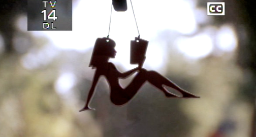
| Screencap via Jezebel.com |
The origin, apparently, is a Wyoming library marketing campaign. I know almost nothing about Wyoming, but apparently their libraries are awesome. I think it's a fun campaign. Why not take a sexist symbol and add some substance to it? I like that they don't completely take away the sexy, since there's nothing wrong with associating reading with sexiness. (People who read are sexier than those who don't, after all.)

If you do think she's too sexy, Reading is Sexy on Cafe Press has a design of a clearly clothed girl reading in the mudflap position. It comes on a variety of items, from T-shirts to buttons.

How do ya'll feel about the reading mudflap girl?
I do think she's very cute but I'd be wary of to whom she is being marketed - more sophisticated girls and women will get the irony but younger ones may simply accept the image and not question why a "sexy girl" is being used to promote books (hey why not a "sexy boy"?). They may seem innocent enough but these sorts of images subtly tell girls that a woman's body is (a symbol) to be used to sell things.
ReplyDeleteI actually am from Wyoming and I do not recall seeing this campaign.
ReplyDeleteI like it. That mudflap girl has always irritated me so it's good to see it being subverted.
ReplyDeleteLove the idea!!!
ReplyDeleteActually, the *original* Smart Mudflap Girl can be found here:
ReplyDeletewww.smartmudflapgirl.com.
Not disrobed like Ms. Wyoming, and mellower than the copy, she's got her own style.
Oh my gosh THANK YOU! I saw this image on a pick up truck and I have been looking for her everywhere! I am definitely getting myself a t-shirt.
ReplyDeleteI totally love it, just bought one for my car today!
ReplyDelete