
I love the expression on the model's face. (Off course, I've always had a thing for photos that look more like a candid than posed smiley.) Her pose causes her neck to be a little lost, but I can live with that. I love that the dress is classier than on the previous cover. I think it would look even better with the background flipped, so that she's highlighted by all that yellow and the part that is unobscured is the interesting pink and orange striation. (I do love the colors - bright, eye-catching, not too girly.) But as we know from experience, it could be worse.
For comparison, here are the ARC and original paperback covers:

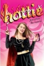 Which do you like best? What do you see as the pros and cons of the new cover? Do you believe it will attract teens and bookstore buyers more than the previous two attempts? Or do you think this one is a step *back*? Don't forget to read my interview with Jonathan Bernstein, where he explains his feelings on the original cover change. Or to read my review of the novel, in which I deliver a point-by-point explanation of why I hated the second cover.
The first cover was better, but this is a HUGE improvement over Barbarella.
ReplyDeleteOK, the current one is awful, but the first was cute. I do see how it could be a bit tacky, though. The new one is oK....I just don't like the model's expression at all!
ReplyDeleteIt's an overly campy expression, but it's not like the novel is a period drama or anything. XD
ReplyDeleteBarbarella is the perfect way to put it.
ReplyDeleteAw, I really like the expression. And I have pics of my friends making that exact same face. It's silly, but fun. Whereas the second one is just awkward.
I still don't like any of them. In fact, my favorite is still the cartoon. Might as well cartoonize the cover if you want to have such a fake pose. Someone still needs to work on giving this book a better cover, because it's still not attracting my attention as it is.
ReplyDeleteI still like the cartoon version.
ReplyDeleteThis one is much better than the last, but I still like the cartoon one the most. This one is very...yellow.
ReplyDeleteMy favorite is still the original, but this new cover is WAY WAY WAY WAY better than the second one. While I've heard the reason for changing the original, I think it's such a stupid reason and I still don't understand the need to change it. I think most everyone who matters (i.e. the actual READERS of the book) was happy with the original cover.
ReplyDeleteI loved the original cover on the ARC but this is a lot better than the one that is currently being used.
ReplyDeleteYeah, I like the cartoon best, but I do think this one is pretty close to a live-action version of the cartoon.
ReplyDeleteAnd Khy, I agree very much about it being quite yellow. That's why I think the bg would look better flipped.
Book Chic - but how would the readers see the cover if stores didn't stock it? Brick and mortar sales still rule.
True. I guess what I mean to say is that bookstores really shouldn't have a say in what the cover looks like. I find it so silly that books are sent back for title or cover changes because one or two people at the store headquarters don't like it when everyone else loves it. I still love bookstores- I just wish they didn't have so much control.
ReplyDeleteEh, I still prefer the original cartoon version of the cover. It's cute, and fits the theme/font. Both the new ones are just tacky looking. The original cartoon cover, if I saw in a store, I might pick it up to check what it's about. The newest two covers... probably wouldn't give them a second glance. I mean, the model on this latest cover is nicer, but at the same time, the font and background - no offence, but it just looks like a really amateurish job.
ReplyDeleteI do like it with flames behind it, but other than that it's the same title treatment on all three books.
ReplyDeleteAnd you aren't going to offend me deltay. I didn't make it.
Book Chic - I do wish the bookstores had less power. I do trust people who have been in the business to know what sells . . . but I still can't believe they didn't think the cartoon cover would sell better either.
Cartoon. Hands down.
ReplyDeleteI still hate it. I wish they'd scrap this idea. The first was the least offensive for me. I feel sorry for the author, hopefully they can do better for his next book's cover.
ReplyDeleteAmee, I was disappointed when I opened the file and saw that they simply mixed the previous two covers with the same concept. It's just live-action with the same type clothes and similar pose of the cartoon. I do think the designer(s) should have considered that this concept defeated him/her twice and that maybe something totally new should be done.
ReplyDeleteUgh. I don't like the new cover. At all. I even like the current cover better than this new one. But the cartoon cover on the ARC is still the best. The girl on the new cover looks almost like a middle-aged woman, but empty-headed. It also doesn't look very professional.
ReplyDeleteOh, and they still can't get the H logo right. It's supposed to be like the anarchy symbol, but with an 'h'.
ReplyDeleteAs an author, I have to say that it's absolutely amazing that he GOT three covers! With the way publishing is today, I'm shocked that they spent the money to redesign and reprint without selling through the initial print run. That's a huge financial loss, and regardless of how awful the third cover is, Jonathan Bernstein must be pretty happy that his publisher was willing to go to these lengths.
ReplyDeleteAnd I still like the cartoon cover best, hands down.
ReplyDeleteI like the cartoon cover the most, but the new cover is much better than the other one.
ReplyDeleteI still like the cartoon cover the best, but this one is waaay better than the second cover, which is awful. And honestly, that cover is in my library, and it's a hard sell to my teens-I have to tell them to ignore the cover. So whoever decided on that one didn't know teens at all!
ReplyDelete